By Jon Arne Sæterås
The real problem is not whether machines think, but whether men do.
B. F. Skinner
 Finally, the long-awaited Responsive Images specification (respimg) is making its way into browsers. Briefly summarized, the Responsive Images specification introduces two new attributes to the img element, sizes and srcset, and a brand new <picture> element. The Responsive Images Community Group (RICG) has outlined 9 different use cases that the new method for displaying images on the web should address.
Seen from web developers’ and content editors’ perspectives it makes sense to combine these 9 use cases into 2 scenarios. Jason Grigsby did exactly that in a recent blog post. These are:
- Resolution switching – When screen size, pixel density or view port require different versions of the image.
- Art direction – When the contents of the image need to be different to preserve the meaning or readability.
So far so good. This is all great news! However, when reading the specifications and looking at examples of implementation, I wonder if the average web developer, or average web editor using a CMS, will make use of all the flexibility in the respimg specification. True, if done right, respimg will reduce the bandwidth consumed by images. Also true that you don’t have to implement all the bells and whistles to make a positive impact.
The question is; how many of these bells and whistles will the average web site implement in foreseeable future? Brad Frost has already told us what he thinks.
This issue is critical for how images are handled in the future. Joshua Benton predicts that the size of graphics continue to increase because developers and designers are using and designing for high DPI desktop screens like the recently announced 5K iMacs.
The answer to the question of practical implementation of responsive images lies somewhere in the classical trade-off between cost, time and quality: “How cheap and quick can I make this web page with a reasonable level of responsive qualities?”
Simple Resolution Switching Example
Below is a basic example of how srcset can be use to address the common and compelling use case for resolution switching. This snippet tells the browser to download and display pic_480.jpg for 1.5 dpr screens, pic_640.jpg for 2 dpr screens and use the pic_320.jpg as a fallback for everyone else. (We made this simple demo if you want to test in your browser)
<img
  src="pic_320.jpg"
  srcset="pic_480.jpg 1.5x, pic_640.jpg 2x,
  width="320" alt=“fixed width”>
Good. You might say this is obvious, but for the above example to work, you need three versions of the image to exist. Someone, or something, must create them. This costs money and takes time.
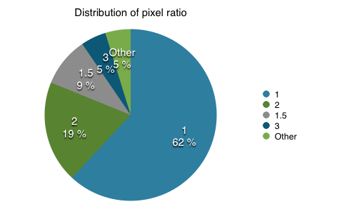
And who says there won’t be 15 different device pixel ratios to consider? In ScientiaMobile we battle these issues every day. According to our own data, to cover 90% or of the devices you need to provide images in device pixel ratios 1, 1.5, 2. To get to 95%, add 3.
We can of course make it more specific by using the sizes attribute to tell the browser which image it use in certain viewport sizes by applying media queries. This is quite powerful (but verbose) functionality which also handles device pixel ratio. As you can see, what started out as a simple scenario for applying srcset can quickly balloon your code and require much more work in preparing multiple sizes of images.
Art Direction
Our next scenario is Art Direction: This scenario requires serving images that are not only different pixel sizes, but also images that should be cropped differently or have a, different aspect ratio. Let’s jump to our example to see how an art directed version may look:
<picture>
  <source media="(min-width: 36em)"
    srcset="2art_full_3050.jpg  3050w,
      2art_full_2048.jpg  2048w,
      2art_full_1280.jpg  1280w,
      2art_full_1024.jpg  1024w,
      2art_full_800.jpg  800w,
      2art_full_400.jpg  400w"
    sizes="50vw" />
  <source
    srcset="2art_crop_1860.jpg 1860w,
      2art_crop_1280.jpg 1280w,
      2art_crop_1024.jpg 1024w,
      2art_crop_800.jpg 800w,
      2art_crop_400.jpg 400w"
    sizes="100vw" />
  <img src="2art_crop_320.jpg" alt="art"/>
</picture>
The inner workings of <picture> is well described elsewhere and you can stretch and tune this how far you want. The example above is quite comprehensive and covers high dpi tablets (like Kindel Fire HDX 8.9”) all the way down to a 320px image. It’s up to the browser to pick whatever src it deems appropriate. Of course, the more options we provide, the better the result will be in terms of saved bandwidth and image quality.
In the example above, we now have 12 versions of the same image. Twelve!
This is without offering different image formats – which also is supported! With all this new code and syntax, one might start wondering if the bytes added will zero out the savings from bandwidth by serving optimized sources. With the power of media queries we can make this as complex or easy as we find necessary.
Back to my initial question. Will this powerful functionality be implemented on the average web page? Possibly, but I have doubts. I think front-end developers and web designers are likely to adopt some of the flexibility, but what about those who make content management systems, web developers and, last but not least, the people who actually produce the content? Will they create twelve different versions of an image? My crystal ball says no. Other peoples crystal balls see the same future.
Although I am convinced that some of respimg functionality will be used in the future, I just don’t believe most designers will want to spend the time and money to achieve great quality. Even if WURFL has been roaming the wilderness since the dawn of the “non-desktop web”, I think WURFL and Device Detection will still roam today’s web for the time to come.
WURFL and Server-Side Detection
While recourse to Server-Side detection and optimization is often frowned upon by the current RWD orthodoxy, it still represents an approach that mobile developers have successfully adopted since the first WAP devices launched in 1999. Mobile developers have used WURFL as a component in solutions that resize their pictures server-size. Using WURFL, they achieve great results in three ways that the Responsive Image specification is not delivering:
- Automatically: no need for manual image editing
- Dynamically: no need for explicit deployment of new versions of existing pictures
- Contextually Aware: understanding the capabilities of the device requesting the image and adjusting accordingly
Of course, WURFL provides only one of the components, with the creation of the actual framework left as an exercise for developers, thanks to tools such as GD, ImageMagick, JAI and Image.io.
Recently, ScientiaMobile has decided that server-side image resizing should no longer be left as an exercise for the reader, and we launched a tool in this space: ImageEngine.
ImageEngine and Responsive Images
In its simplest form, ImageEngine is straight forward to use. The following code:
<img src="https://try.imgeng.in/http://example.com/image.jpg">
will resize and optimize the image according to a device screen size. The detection of the device and its screen size comes from the latest version of WURFL. This is ImageEngine’s simplest form. There is plenty of extra control that developers have thanks to resizing directives that can piggyback on the query string (ImageEngine documentation has the details).
We can take this a step further and apply ImageEngine to the example we used to illustrate resolution switching above:
<img
 src=“https://try.imgeng.in/w_200/http://example.com/image.jpg"
 srcset="https://try.imgeng.in/w_300/http://example.com/image.jpg 1.5x, https://try.imgeng.in/w_400/http://example.com/image.jpg 2x"
 width=“200" alt=“Me”>
We have already saved ourselves the work of creating (and managing) two image sources. And, no matter how complex we make our srcset, only one single image source is all we need.
Conclusion
The Responsive Images specification has ambitious and worthy goals. HTML authors can provide hints to the client on how to select the most suitable images for their web pages in multiple ways. In fact, resping is great because you no longer need third party JavaScript hacks to determine which version of an image to present by sniffing the viewport size and pixel ratio. The new syntax does this for you.
While the specification is powerful, support for the new features must be built into browsers first, and into CMS platforms, tools and other web-authoring tools after that. Arguably, support in CMS is going to be harder than support in browsers. Managing different image versions and resolutions, supporting art direction and extending the editorial process is the toughest part – one that can hardly be fixed with a software upgrade.
This is where ImageEngine can greatly help web authors already today whether you start implementing respimg or stick to the familiar method. Once again, the server-side and client-side complete each other.


