Executive Summary
Many CMS platforms enable you to create content that can be effectively consumed regardless of the screen size of the requesting device. For example, EpiServer builds an abstraction layer on top of Bootstrap and exposes Bootstrap’s responsive breakpoints through customizable views. However, Bootstrap only offers the features available with plain queries. In other words, you can differentiate views based on the screen size, but you never know anything about the host operating system or connectivity. If you need to serve content based on true knowledge of the underlying device, then device detection is the only way to go. And WURFL® by ScientiaMobile is the industry standard platform for client and server-side device detection. For a whitepaper on our solutions for adding device detection and image resizing to CMS systems, please download our PDF here.
Introduction
There are many Content Management Systems (CMS) that can benefit from using Device Detection. For example, EpiServer is a popular CMS platform for building content management solutions in the web space. Like anything else today that is offered through the web, EpiServer is not immune from the need of giving users an ideal experience regardless of the device they use to connect and work. EpiServer always serves content that fits any screen, from the size of a smartphone up to the far larger size of a desktop computer. As an EpiServer developer, you can easily configure the specific content that users will see on mobile devices and you can choose content from the same list of assets available for desktop devices.
Sounds like the perfect deal? Well, not exactly.
EpiServer achieves its multi-device goals by making intelligent use of Responsive Web Design (RWD). With RWD, you can switch CSS attributes based on the current size of the screen and the value of a few other browser-detectable properties.
None of these properties, however, can give you 100% certainty that the underlying device is a true mobile device. Nor can these properties provide additional information about the device.
What Vanilla RWD Doesn’t Give You
In a nutshell, RWD is a set of web programming techniques that take advantage of the browser’s implementation of the CSS3 Media Queries standard. The CSS3 Media Queries standard requires browsers to track the status of a few global settings and notify hosted pages of changes. Settings include screen width and height, color-depth and orientation.
The upcoming CSS4 Media Queries standard adds more properties specifically aimed at detecting tablets but still it doesn’t go beyond the point of making the guess about the nature of the user agent (mobile or desktop) more accurate.
With RWD, you cannot distinguish between a 480 pixel-wide screen of a smartphone and a resized desktop browser’s window. Furthermore, with RWD you have no way to get reliable information about the operating system, the browser, and the actual capabilities of the device. With RWD alone, you can’t say if your website is being viewed with an iOS or an Android device.
To go beyond vanilla RWD, you need to add device detection to your web solution. Device detection simply consists in an in-depth analysis of the browser’s user agent string. Parsing the user agent string, however, is only half the work, albeit probably the toughest half. The second half of the work is mapping the detected device to the correct set of capabilities so that you can check them programmatically and serve your users intelligent markup.
This white paper introduces WURFL—the industry standard for device detection—and shows how to integrate it with a CMS platfrom like EpiServer. However, no technical aspect of the WURFL API is adapted or tailor-made to work specifically with EpiServer. In other words, the features and techniques shown in the whitepaper can be applied to other CMS products based on the ASP.NET platform. The list includes (but it is not limited to) Kentico, DotNetNuke, Umbraco and Kooboo.
The WURFL Framework
There are four ways that you can integrate the WURFL framework with EpiServer to achieve the benefits of device detection.

ImageEngine is a web service that serves as a proxy between your clients and the images that your application may serve. ImageEngine sits in between, acting as a mobile-device-aware CDN, and intelligently resizes images on the fly based on the detected capabilities of the requesting device.
WURFL.js is a web service that uses client-side and server-side detection to make device information available in the browser’s context via a JavaScript tailor-made object.
Finally, WURFL OnSite and WURFL Cloud are classic server-side ASP.NET libraries that enable device detection on the server side so that you can carefully review the capabilities of requesting browsers before rendering any markup.
Let’s delve deeper into each of these tools.
Using ImageEngine
ImageEngine by ScientiaMobile is an image resizing tool exposed as a web service. Its purpose is to ensure that images served to requesting browsers are always of the appropriate size. With vanilla RWD, you have an easy way to display images with the size of a thumbnail but that is only a visual effect. If the HTML view references a high-resolution picture, then all that vanilla RWD allows you to do is instruct the browser to resize it on the fly. As a result, a far larger image is downloaded to display with the size of a thumbnail. By using ImageEngine, you can significantly reduce the image payload and load time, especially over a slow 3G connection. On many sites, payload savings average 60%! These savings can mean pages loading several seconds faster.
Much like a classic CDN, ImageEngine sits in between your server application and the client browser and serves images on behalf of the “real” server. The figure below shows the overall architecture.
The trick consists of referencing the image through your ImageEngine server instead of your actual web server. The first time an ImageEngine server receives a browser request for a given image, it downloads the image from the original server and then checks the browser’s agent. ImageEngine relies on the services of the WURFL framework to determine whether the original size of the image is compatible with the capabilities of the detected device. If ImageEngine determines that the image is too large, it quickly resizes the image down to what it considers an acceptable size. The resized image is then cached for future use.
To start using ImageEngine on your website all you need is a trial account. You just go to http://my.scientiamobile.com/imageengine/app/signup and follow the instructions. The account you create identifies you with a name and helps the server keep your traffic distinct from other users. Before you create an account, though, you can play with the test account. Here’s how it works.
In a web view, you usually display images as below:
<img src="/images/yourimage.jpg">
When you use ImageEngine, you replace it with the following markup.
<img src="//tryimgeng.in/http:www.yoursite.com/images/yourimage.jpg">
Once you have your account, you replace “try” with your account name. If the account name is, say, “contoso” then the URL of the image becomes:
<img scr="//contoso.imgend.in/http://www,yoursite.com/images/yourimage.jpg">
ImageEngine supports a number of parameters including some to control cropping and sizing algorithms. This means that ImageEngine can do all the job transparently, but you still have the power to control actual results. For more information about the ImageEngine configuration, visit http://web.wurfl.io/#image-engine.
Using WURFL.js
WURFL.js is a web service you invoke from JavaScript to learn about the capabilities of the device. Any collected information can then be used to programmatically adjust the displayed content directly from the browser’s scripting environment. WURFL.js uses the same underlying detection framework as ImageEngine.
In spite of the name, WURFL.js is not a static JavaScript file you can host on premise or upload in your cloud site. More precisely, WURFL.js is a HTTP endpoint you link to your web views through a regular SCRIPT element.
<script type=”text/javascript” src=”//wurfl.io/wurfl.js”></script>
The browser attempts to connect to the specified URL and downloads and executes any script code it receives back. The WURFL endpoint that receives the request uses the user agent of the calling device to figure out its actual capabilities. Next, it arranges a tailor-made JavaScript object and returns it to the browser. After the browser has processed the aforementioned SCRIPT element, here’s an example of what you get in the DOM:
var WURFL = {
   “complete_device_name”:”Apple iPhone 5”,
   “is_mobile”:true,
   “form_factor”:”Smartphone”
};
The returned JavaScript object contains three pieces of information: the device name, the form factor and a Boolean flag to denote whether it is a desktop browser or not. In particular, the form factor parameter specifies the class of the detected device. It can be any of the following strings: Desktop, App, Tablet, Smartphone, Feature Phone, Smart-TV, Robot, Other Non-Mobile, Other Mobile. Here’s a brief example of how to use it in an EpiServer application.
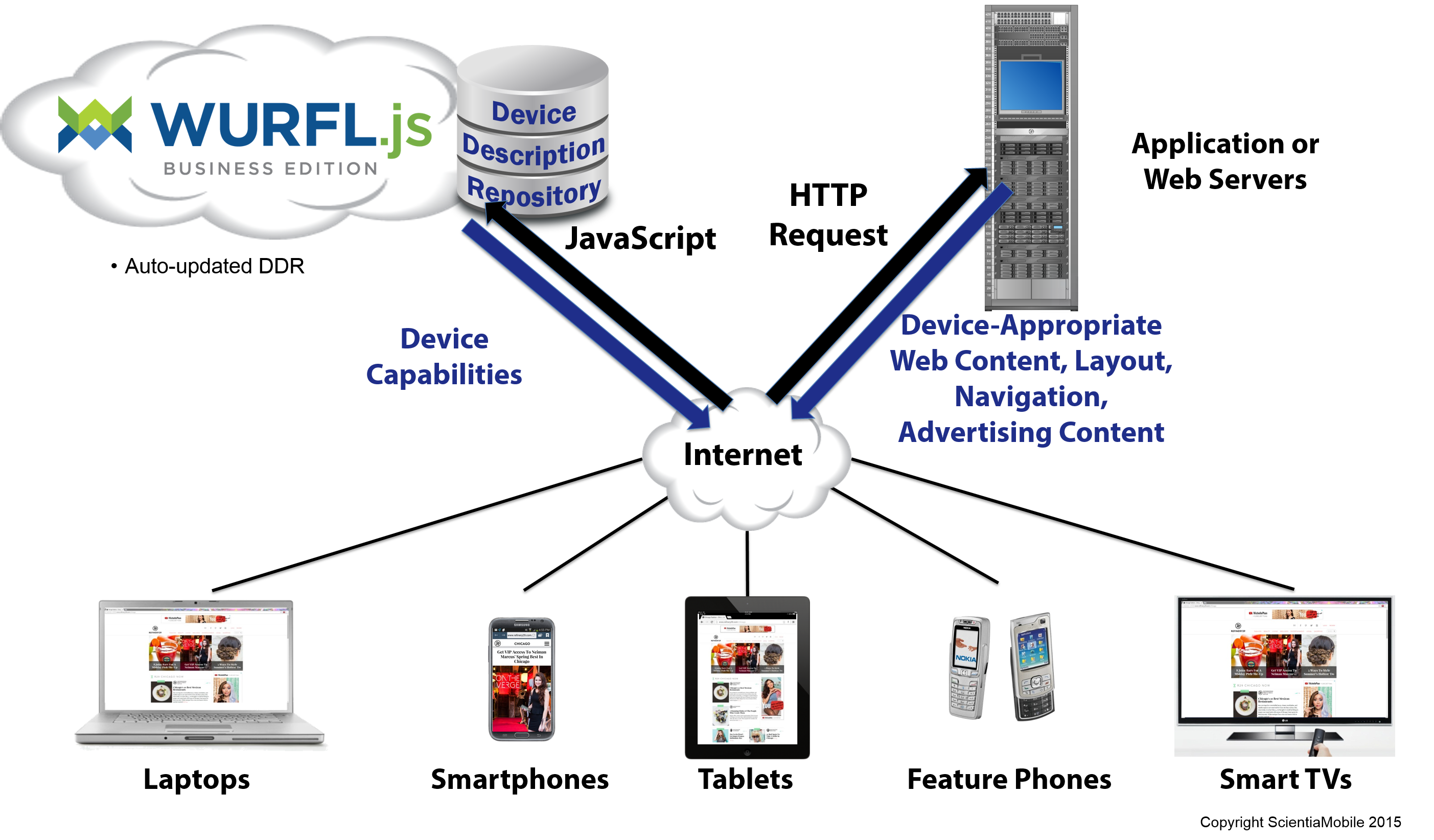
Imagine that one of your views has some content that you only want to only show to mobile users. The Bootstrap responsive support built into EpiServer allows you to use classes like visible-phone and hidden-phone to hide and display content for certain types of devices. As mentioned, though, Bootstrap only relies on CSS media queries to decide what is a “phone” and what is a “tablet”. When you use responsive CSS classes in EpiServer, you are actually deciding to display based on the size of the view — i.e. the typical size of a phone or a tablet— regardless of whether the device is really a phone, a tablet or a notebook.
WURFL.js gives you more power and accuracy. It lets you decide programmatically what to show after checking if the requesting browser is running is an actual phone, tablet, or PC. To enable WURFL.js in EpiServer, you start by adding the following to a view. Better yet, you can add it to the root layout file so that it will be inherited by all derived views.
<script type=”text/javascript” src=”//wurfl.io/wurfl.js”></script>
Next, in all pages based on that layout, you can programmatically access the JavaScript WURFL object as shown in the code snippet below.
<div id=”mobile-only-content”>
    Mobile device
</div>
@Html.PropertyFor(x => x.CurrentPage.MainContentArea,
     new { CssClass = “row equal-height”, tag = Global.ContentAreaTags.FullWidth })

<script>
    if  (WURFL.is_mobile)  {
         $("#mobile-only-content") .show() ;
    }  else  {
         $("#mobile-only-content") .hide() ;
    }
</script>
WURFL.js can be used in many different scenarios including browser personalization, enhancing analytics and optimizing advertising. Further, if you are a front-end developer and implementing device detection on the server side is not an option for you, then WURFL.js is your savior. For more examples, check out the WURFL.js documentation at http://web.wurfl.io.
Server-Side WURFL
EpiServer does a great job of shielding you from the nitty-gritty details of implementing responsiveness. EpiServer’s predefined assets know how to adapt their content to the available screen size and all you do is select the layout, and decide what to hide and what to show. The final result you serve to users is always effective from a purely visual standpoint, but is it as effective from a performance perspective?
Vanilla RWD doesn’t let you access device information, and it doesn’t let you differentiate content based on operating system, type of connectivity, CPU and so forth. However, let’s focus on the simplest scenario where all you need is to differentiate by device type. Well, with vanilla RWD you are hardly serving users the minimal amount of content that is going to be displayed. The amount of downloaded content is mostly the same – regardless of the device type and connectivity. If users get views that fit nicely with the actual screen real estate, then it is only because EpiServer—and Bootstrap under the hood—hide extra content. Quite paradoxically, more content than necessary is downloaded with vanilla RWD —sometimes over slow connections—just to be hidden by browsers! To avoid that, you should consider using device detection. Here’s how to do that with WURFL.
If you’re writing an ASP.NET application, you can integrate WURFL device detection either via an on-premise API (WURFL OnSite) or a cloud-based API and related client (WURFL Cloud). In both cases, the API you call from your code is a DLL you can get by registering on the ScientiaMobile web site. With WURFL OnSite, you also get the device repository to install on your server and access to the API. You are also responsible for downloading weekly repository data updates from your ScientiaMobile customer’s vault. If you choose the WURFL OnSite API, everything is under your control and the query performance is the fastest possible. Here’s how to use WURFL OnSite.
Suppose you want to give your mobile users a direct link to access the app associated with your site. You want to place a link in the home page that points iOS users to AppStore page of your app, and Android users to the corresponding page on the Play Store. The first step is getting device information. But before that, you must initialize the WURFL library in global.asax.
public class EPiServerApplication : EPiServer.Global
{
public static IWURFLManager WurflContainer;
protected void Application_Start()
{
AreaRegistration.RegisterAllAreas();
//Tip: Want to call the EPiServer API on startup?
//Add an initialization module instead
//(Add -> New Item.. -> EPiServer -> Initialization Module)
// Initialize WURFL on-premise
WurflContainer = WURFLManagerBuilder.Build(new ApplicationCon-
figurer());
}
}
For this code to run successfully, though, some preliminary configuration work is required. In particular, you need to have a new section defined in the web.config file.
<configuration>
 <configSections>
    <section name=”wurfl”
       type=”WURFL.Aspnet.Extensions.Config.WURFLConfigurationSection,
             Wurfl.Aspnet.Extensions,
             Version=1.8.0.0,
             Culture=neutral”/>
  </configSections>
 :
</configuration>
Note that the version number of the DLL (bold) refers to the latest available at this time of this writing. The newly created section must be populated as below:
<wurfl mode=”performance”>
<mainFile path=”~/App_Data/wurfl-latest.zip” />
</wurfl>
The most important piece of information contained here is the location of the device repository file. It is common to place it under the App_Data folder, but any other location is fine. At this point everything is ready to access the device information via the WurflContainer object.
@{
// Grab WURFL info for a given UA
var deviceInfo = EPiServerApplication.WurflContainer.GetDeviceForRequest(Request.UserAgent);
if (deviceInfo.GetCapability(“is_mobile”) == “true”) {
var cap_OperatingSystem = String.Format(“{0} {1}”,
deviceInfo.GetCapability(“device_os”), deviceInfo.GetCapability(“device_os_version”));
<span> @cap_OperatingSystem</span>
}
}
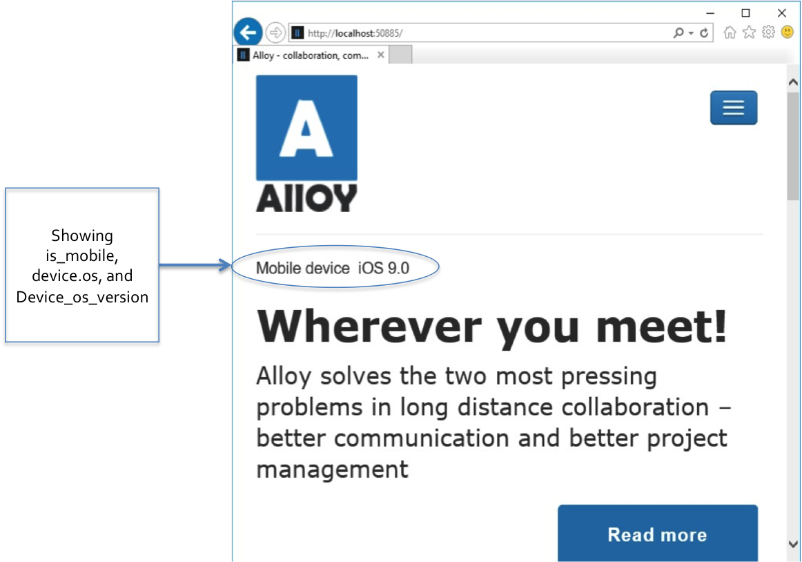
Placed in a Razor view, the code above displays the detected operating system only if the detected device is a true mobile device. Once you reliably know the operating system adjusting the user interface accordingly is trivial. (See picture below.)
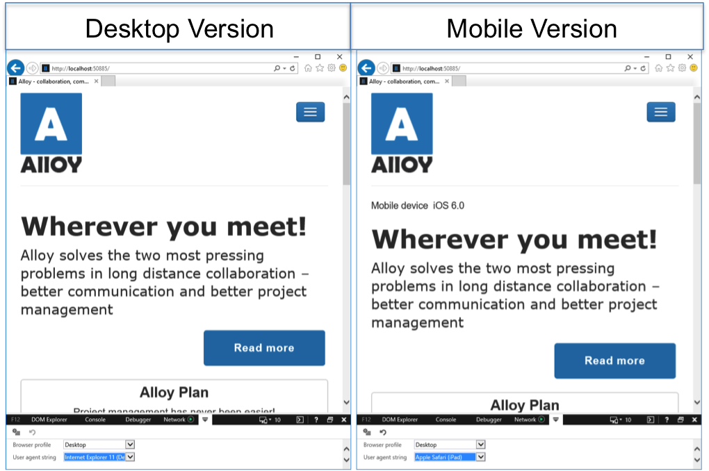
Now that you’re in total control of the server side, it’s interesting to see what happens if you view the sample page at the same screen size on a desktop device and mobile device. As the picture below shows, no mobile-only content is displayed regardless of the size if the browser is a desktop browser.
WURFL Cloud
The WURFL on-premise library is not the only option you have on the server side. If maintaining the device data repository yourself doesn’t sound very exciting, or the cost of a full-fledged, high-performance API doesn’t suit you, then you should have a look at WURFL Cloud.
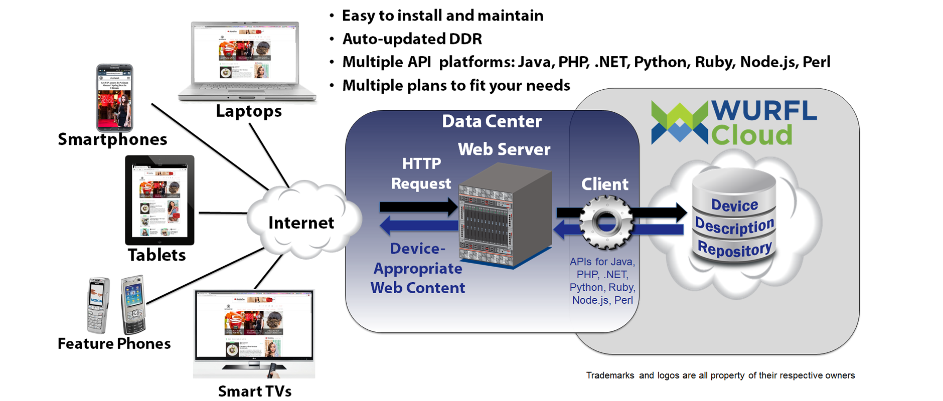
The WURFL Cloud service relies on the same engine as the WURFL OnSite API, except that any call to the engine is queued to a single service where maintenance of the repository is centralized. The WURFL Cloud service doesn’t give you direct access to all of the WURFL capabilities. When initially configuring your account, you must select the capabilities you desire. WURFL Cloud Lite accounts receive three capabilities and 5,000 detections per month for free. You can change the three capabilities at any time. If you need more capabilities or detections, WURFL Cloud has paid plans that will suit your needs.
var config = new DefaultCloudClientConfig
{
    ApiKey = “your API key here”
};

var manager = new CloudClientManager(config);
var info = manager.GetDeviceInfo(context, new[] {
    “is_smartphone”,
    “is_wireless_device”,
    “is_tablet”,
    “complete_device_name”,
    “advertised_device_os”
});
In the code snippet above, you use the GetDeviceInfo method on the cloud API to retrieve the values of the specified five properties previously configured in your customer’s vault. Note that in both WURFL OnSite and WURFL Cloud, values are always returned as strings.
WURFL InFuze Module for IIS
The three ways shown so far to integrate WURFL in your EpiServer solution require some development effort to get ahold of device specific information. There is also a fourth way which is mostly declarative and makes every request carry device specific information.
For
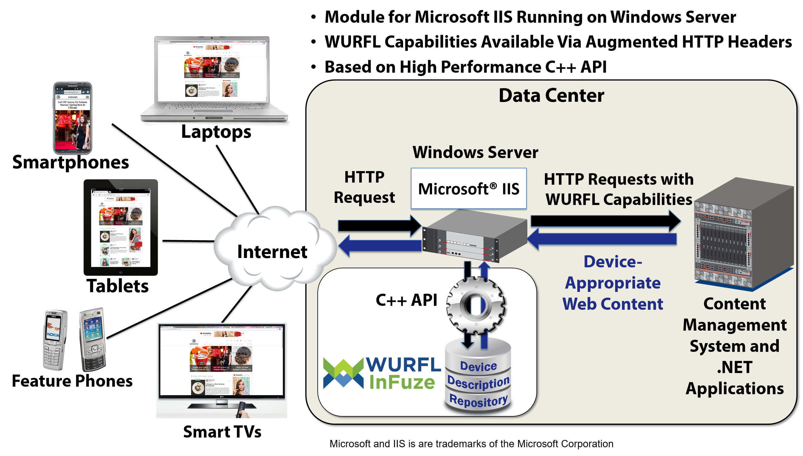
For maximum performance, ScientiaMobile offers WURFL InFuze for Microsoft Internet Information Services (IIS). This module filters all incoming requests, checks the HTTP request and places additional HTTP headers in the request with device specific information. To get the extra headers, all you need to do is install and configure the component. WURFL InFuze configuration consists of editing the wurflconf.xml file in the installation folder. The XML file contains a collection of WurflRequestCapability elements, which define the WURFL capabilities that you have licensed.
<WurflIIS>
   :
   <WurflRequestCapability>is_tablet</WurflRequestCapability>
   <WurflRequestCapability>is_wireless_device</WurflRequestCapability>
   :
</WurflIIS>
For each specified capability, a new HTTP header is added with a name that follows the pattern below:
WURFLCAP_XXX
Where XXX is the uppercase name of the capability. For example, the code snippet above will add the following two headers to the HTTP request headers:
WURFLCAP_IS_TABLET
WURFLCAP_IS_WIRELESS_DEVICE
Here’s how to extract the values from the WURFL capabilities inside your ASP.NET code:
var is_tablet = HttpContext.Request.Headers[“WURFLCAP_IS_TABLET”];
if (is_tablet == “true”)
{
    // DO what you’re supposed to do for tablets
}
else
{
    var is_wireless = HttpContext.Request.Headers[“WURFLCAP_IS_WIRELESS_DEVICE”];
    if (is_wireless == “true”)
    {
        // Do what you’re supposed to do for wireless devices
    }
}
WURFL InFuze may operate for all websites under the current instance of IIS or for just a few of them. In the configuration file you can use a regular expression to list all the sites for which WURFL InFuze should be enabled. Even better, for each site you can specify a list of URLs to monitor (whitelist) or those to exclude (blacklist). For more information, check out https://docs.scientiamobile.com/documentation/infuze/infuze-iis-module-user-guide.
About Us
ScientiaMobile provides the industry’s most accurate and flexible device intelligence solution, helping customers deliver great web experiences and manage the increasingly fragmented mobile device ecosystem. ScientiaMobile sells WURFL, a constantly-updated repository that cataloges thousands of devices and their capabilities and provides access to them via a range of API languages. The WURFL framework enables many organizations, including Fortune 500 companies, to effectively design and analyze web experiences for an ever-growing range of smartphones, tablets, smart TVs, and game consoles. ScientiaMobile also powers WURFL.io, a collection of free tools designed to help front-end web developers easily improve their mobile user experience.


