So you have built a responsive web site. Congratulations – all of your mobile web problems are now solved! Well, not so fast. A common complaint is that responsive web sites look great on mobile devices, but the pages and images load slowly. Mobile users expect fast-loading sites and will start to abandon after several seconds. The biggest cause for slow-loading is oversized image payload. Typically, developers choose from 4 options to load images on mobile devices. Steve Kamerman, ScientiaMobile’s COO, outlines these approaches in an interview at Velocity 2016 – a conference focusing on web performance (start at 2:10)
3 Reasons Your Images Load Slowly
To summarize these approaches:
- No optimization. You use a single image size, typically proportioned for a full desktop. Cons: The image is larger than it needs to be for mobile. The result is a large payload. Pages and images load slowly, it is expensive and it drains battery.
- Responsive images. The responsive images specification lets you specify different sizes and formats based on the size of the browser window. Cons: You need to pick the breakpoints on beforehand and create an image for each, which means more work for the editor and web developer. Further, you’ll need a polyfill to make sure responsive images will not fail on some browsers.
- Lazy load images. By using some clever JavaScript hacks you can first load the html and let a JavaScript figure out which image sizes to load. Cons: You’re breaking the browser’s pre-loader and putting the JavaScript in the “critical rendering path” which significantly slows the page down. There is also a risk of downloading versions of the image you really don’t need (over-downloading).
Use a Solution With Proactive Device Intelligence, Resizing, CDN
None of the 3 approaches provide fast-loading pages. A much more elegant solution combines Device Detection, real-time image resizing, and an image-CDN that caches previously resized pictures. With proactive device detection, you recognize the mobile device and all its relevant characteristics (e.g. screen dimensions). Once you have this device intelligence, you can resize your full-size image in real-time and deliver via a CDN. And the next time, you need that image size, it is instantly available in the cache.
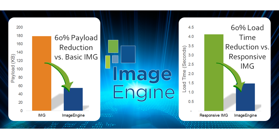
We call this solution ImageEngine. It typically yields 60% load-time improvement. And it is easy to implement. Just insert a short prefix to call the ImageEngine service in front of each of your images. Or, if you have WordPress, you can install the ImageEngine Plugin to instantly resize all the images on your site with the need of a prefix.


