Over-sized image payloads slow down the web – particularly on mobile devices.
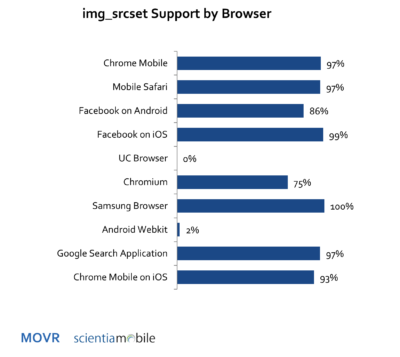
Yes, those hero images look great on large 4K displays used by graphic designers, but it is overkill for an average smartphone user. New HTML elements make it possible to deliver appropriately-sized images to mobile devices. But is the framework too cumbersome to use? Are there better alternatives for delivering right-sized images? In the latest MOVR report, we look at browser readiness for img srcset and picture HTML elements.
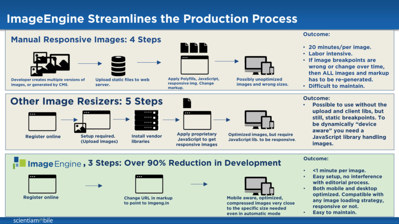
A comparison of the Responsive Image HTML approach (img srcset, picture) and other alternative shows some real productivity issues. For a normal image, it may take up to 20 minutes per image to resize multiple versions of the master, determine appropriate break points, insert java script to collect those break points, and develop the code using srcset and picture. Multiply this process by thousands of images on a website, and you have a monumental task.
In comparison, there are more streamlined, automated processes available my using an Image CDN, like ScientiaMobile’s ImageEngine.
For more information, sign up for MOVR and download our 2017 Q1 report.


