“Mobilize or die”
– Ian Carrington (Google)
April 21, 2015 is the date when Google starts updating their search algorithms to consider “mobile friendliness” in the ranking of sites. This means that site owners who have not implemented a strategy for adapting their site and content for mobile devices will be ranked lower than sites that are optimized. This change is radical and will have impact on all mobile searches, in all languages, globally.
Google goes as far as recommending site owners to use Responsive Web Design (RWD). In addition to RWD, Google itself implements both Adaptive Delivery and dedicated URLs for mobile (mDot) on their most important web properties. (See our Legend below for further definitions of these terms)
For sites developers, the paths to “mobile-friendly” are many and not straight forward. This, along with Guy Podjarnys previous work, triggered us to analyze what the most popular web sites globally are doing to cater to the diversity of devices, browsers and their capabilities. Is Responsive Web Design, mDot site or Adaptive Delivery the right way to go? (Or as Google used to name them; Responsive Web Design, Dynamic Serving and Separate URLs)
Based on the top 10.000 URLs, we set up an automated test facility to analyze what happens when a mobile device hit each or these URLs. If you compare our results with Guy Podjarnys experiment, please note the previous sentence, as one of the differences. Our tests see the web from the mobile user’s perspective. For example, if a mobile user is redirected to an mDot site, then the desktop site may still be RWD. This RWD site is not included in our numbers.
Are the Big Boys Ready?
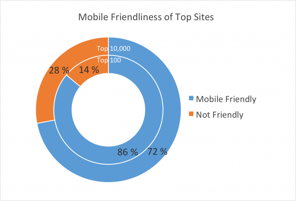
Based on our research, among the top 100 sites, 86% are mobile friendly. But looking at the longer tail, many of the top 10,000 web sites are still not ready. Only 72% of the top 10,000 sites have implemented some sort of “mobile-friendly” approach. This means an alarming 28% of sites appear to do nothing special! These sites would appear like a “zoomed out web page”, typically with a 980px wide viewport (or whatever is default on the specific mobile browser) and with text and links too tiny to make sense.
Server Side Approaches to Mobile-Friendly Are Popular
We used a methodology (see below) to categorize sites by their primary “mobile friendly” techniques. We categorized mobile-friendly sites into one of three buckets: RWD, mDot, and Adaptive Delivery. We recognize that it is not fair to put a site into one category alone, so we also tracked the elements of responsiveness we found in the mDot and Adaptive Delivery sites, so we will drill into responsiveness too. For the purpose if our mobile friendly approaches chart, the techniques are mutually exclusive and we try to identify the “main” technique. For example, if a site is under an mDot domain, but is also using RWD, it is put in the mDot bucket. Further, an mDot site is not considered Adaptive even if the server response is adapted to the specific device.
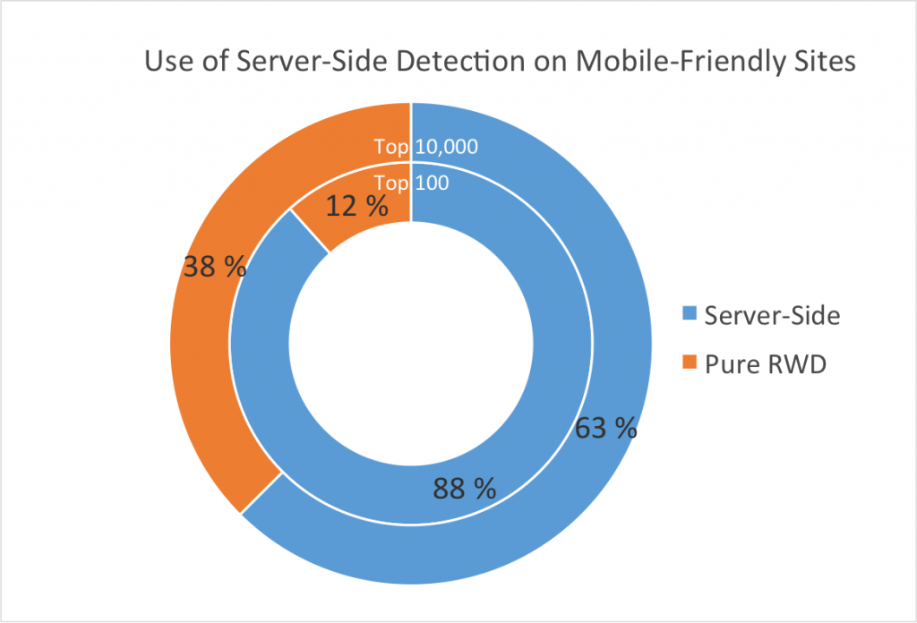
A surprising finding is that despite all the fanfare around how client-side alone (RWD) is the best approach to solving mobile issues, most of the top sites opt for server-side approaches too. Among the top 10,000 sites, 63% used a server-side approach that includes device detection – either mDot or Adaptive Delivery. As we move to this top 100, this grows to 88%.
Clearly, the top sites are driven by practical, real-world solutions which combine approaches. This combination of server-side and client-side approaches is usually referred to as RESS: “Responsive Design with Server Side Components”. We dig into this more later.
Breaking down the top 10,000’s mobile friendly sites, we find that a separate mDot site is the most popular approach at 40%, just ahead of RWD at 38%, and Adaptive delivery at 22%.
In contrast, Adaptive Delivery is by far the preferred approach (52%) among the top 100 players such as Google, Yahoo, Baidu, Bing or Instagram. Conversely, only 12% of the top 100 rely solely on RWD. A separate mDot hostname for mobile devices stays consistent around upper 30 percent across both the top 100 and the long tail.
74% of Top 10,000 Sites Use Responsive Web Design
While our research shows that leading sites use server-side device detection for its power and effectiveness, let there be no confusion: Responsive Web Design is the leading approach for mobile friendly sites. In fact, 74% of the top 10,000 sites use some form of RWD.
However, the choice to use RWD is not a binary or mutually exclusive choice. Many leading sites are combining RWD with server-side detection, an approach called RESS. We found that 49% of responsive sites combine some kind of server side adaptiveness. For example, among mDot sites, 57% carry traces of RWD. Similarly, around 61% of the Adaptive sites carry traces of RWD.
| Responsive Approach Among Mobile-Friendly Top 10,000 Sites | ||||
| Approach | RWD | Adaptive | mDot | Total |
| Responsive | 37.5% | 13.6% | 23.0% | 74.0% |
| Not Responsive | 8.7% | 17.3% | 26.0% | |
| Total | 37.5% | 22.2% | 40.3% | 100.0% |
Client-side Adaptiveness
Google calls this approach “JavaScript-adaptive”. From an SEO perspective, this approach can be a bit tricky since Google bots now also require access to JavaScript resources to index the site properly. If Google bots can’t access these assets, the site may be deemed non-mobile friendly and receive lower ranking. Of the total pool of 10,000 sites a bit more than 50% of the sites are using JavaScript to modify the DOM for mobile devices. This is about the same for both tiers. It is quite common to think of this approach as a natural part of RWD, or even Progressive Enhancement (lines are blurred). 62% of the RWD sites in our test also use JavaScript to modify the DOM for mobile devices.
Conclusion
With the April 21st deadline approaching, the top 10,000 sites are moving toward mobile friendliness. For 72% of popular sites, mobile browsing is nothing new to them. These mobile-friendly sites spend enormous resources in this area, and there is a lot to learn from their techniques. The most interesting lesson from our research is that a site owner does not have to choose between RWD and other approaches in order to optimize for mobile. In fact, RWD should be the basis of all web development. Adapting and optimizing content and/or presentation on the server in combination with RWD is actually the preferred approach in our sample.
Test Setup
For the test system we used Selenium to automate our tests. We analyzed each URL both with a desktop (Chrome) browser and a mobile browser (emulating iPhone 5S using Chrome developer tools).
The list of URLs we downloaded from HTTP Archive.
Test Definitions
The goal of this research was to find out what happens when a mobile device hits the URL and which technique is used to handle mobile. This is how we define each category
Responsive Web Design
For a site to qualify as a responsively designed site, these criteria must be fulfilled:
- Use of Media Queries.
- There must be no horizontal scrollbar (we give the site 15px slack)
- The viewport is defined in a meta tag.
Adaptive Delivery
For a site to qualify as server side adaptive the site must
- Serve different markup to mobile devices compared to desktop device from a single URL. This we defined as more than 10% difference in bytes and different count of structural elements, such as divs. (We exclude mDot sites as those are different by definition)
mDot sites
An mDot site is
- A site with a subdomain or path stating m, mob*, iphone ,ipad or touch
- The site may utilize Responsive Web Design or not.
Client Side Adaptive
A site qualifies as client side adaptive when
- The markup as sent from the server is the same for mobile and desktop devices
- and the final markup (DOM) rendered is different on mobile and desktop. This we defined as more than 10% difference in bytes and different count of structural elements, such as divs. The site may utilize Responsive Web Design or not.
Disclaimer
As mentioned above, it is difficult and unfair to put a site into one category. It is equally difficult to define these categories so that they are testable programmatically. In our data set there are probably sites put into the wrong bucket. We’ve done some probing and fixed a few issues, but still no guarantee. Further, the sites are not tested with a real mobile device, but by using the emulation facilities in Google Chrome developer tools. Still, we believe that the error margin is within the limits. Also worth noticing is that some of the URLs in the list are invalid. Such as http://www.googleadservices.com/. We’ve done our best to cater for this. And of course, during the test, sites may fail to load or only partly complete the tests. These are left out of our statistics.


