Blog
Recent Posts

Use WURFL Device Detection With NGINX for Mobile-Optimized Website, Faster Loading Images
Oct 2nd, 2017
Here is a great video of our Founder and CTO Luca Passani speaking at NGINX Conf 2017. Luca gives a quick overview of how to use WURFL InFuze Device Detection with NGINX to develop a mobile-optimized website.
Read More
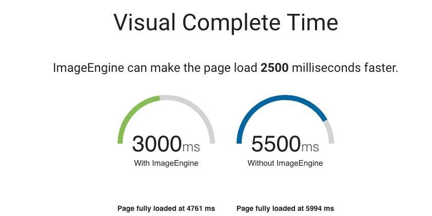
Slow Loading Images in Responsive Web Design? Solve with ImageEngine and NGINX Plus
Sep 28th, 2017
[the following was originally published on the NGINX Blog]
Responsive web design (RWD) has been around for some time, making it through the “hype cycle” and finding its way to the “plateau of productivity”. With RWD, web developers possess frameworks and guidelines on how to make their design adjust dynamically to the browser window and, to some extent, to the form factor of users’ devices.
Read More

4 Steps to Accelerate Image Delivery in Shopify
Sep 13th, 2017
Shopify is one of the more popular “webshops-in-a-box” solutions out there. It’s very easy to get started and it includes all the functionality users need to start a ready-to-use web shop. Managing product images is quite easy. Images are served from Shopify’s own CDN (Content Delivery Network). However, Shopify’s CDN lacks the crucial functionality to fully optimize images – especially for mobile.
Read More

Detect the New iPhone on Your Website
Sep 5th, 2017
The new iPhone is here, and WURFL.js now detects it in the wild!
Apple released the new iPhone in September. Our researchers are already detecting the new iPhone among the more than 2 billion other user agents per month they analyze. If you use WURFL.js, then you will start to see the new iPhone and all other iPhone models. Sign up to get our new iPhone 8 detection here.
Read More

Most Used Chipsets: Samsung and Apple Smartphones
Aug 1st, 2017
Samsung Chipsets
It’s no secret that Samsung uses both its own Exynos chipset as well as Qualcomm’s Snapdragon. Our most recent MOVR (Mobile Overview Report) 2017 Q2, found various versions of the Exynos chipsets account for 73%, whereas Snapdragon accounts for 24%.
Read More
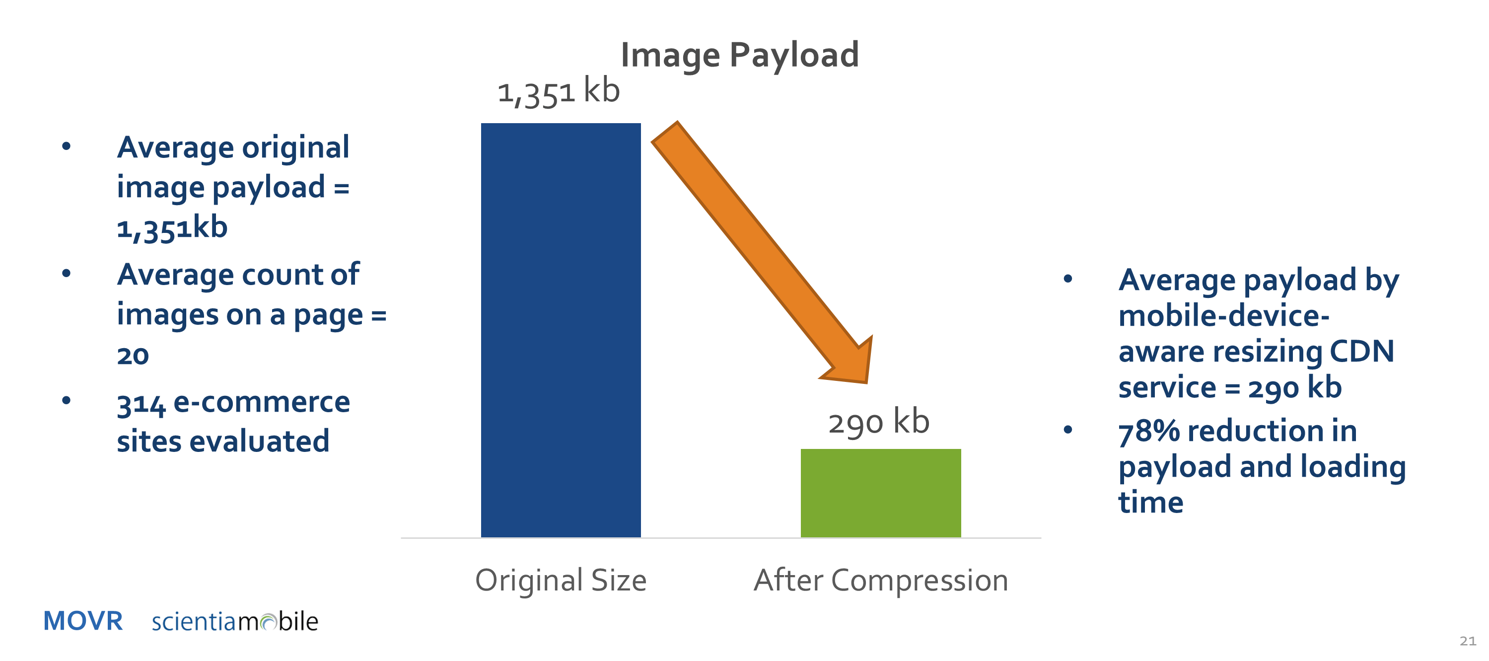
Image Compression and Acceleration Potential for E-Commerce Sites
Jul 31st, 2017
E-commerce sites know that load speed = sales. Users of e-commerce sites frequently abandon if the page they request fails to load quickly. Oversized images are the leading cause of slow loading time. And image compression is a great solution.
Read More

Smartphone Screen Size Trend
Jul 28th, 2017
Shifts in Screen Size Trend
Anyone who has purchased a mobile phone in the last decade has marveled at the reversal in trends when it comes to size. Long gone are the days when Nokia dominated the feature phone market and smaller meant better. Anyone remember the Nokia 8210? Of course, that was before mobile web browsing was a feasible or enjoyable experience.
Read More
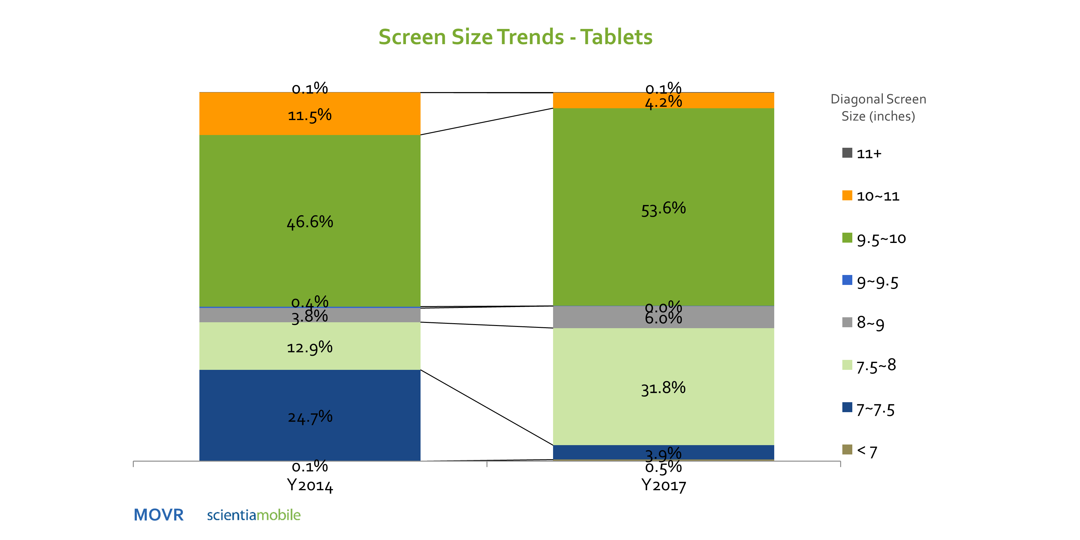
Tablet Screen Size Trend
Jul 28th, 2017
The tablet screen size trend is different than smartphones. With smartphones, we see a clear trend that bigger is better – with 59% of the market over 5 inches in diagonal screen size.
Read More
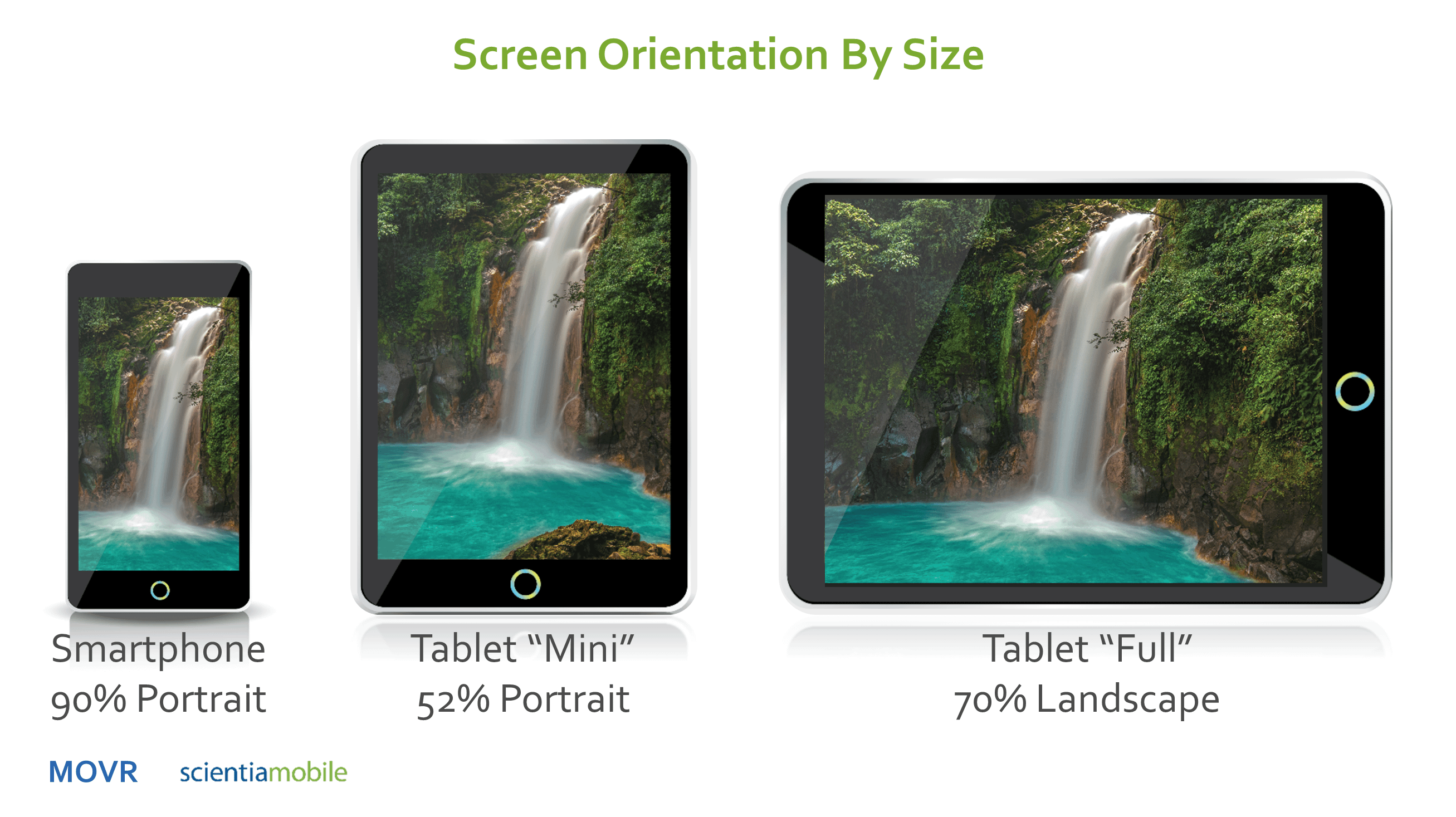
Smartphone vs Tablet Orientation: Who’s Using What?
Jul 28th, 2017
Smartphones and Tablets have become a part of our everyday lives, but how are they typically held and used? People use both Portrait and Landscape orientation to conduct their everyday tasks such as watching a video, taking a picture or even browsing the internet from their device.
Read More
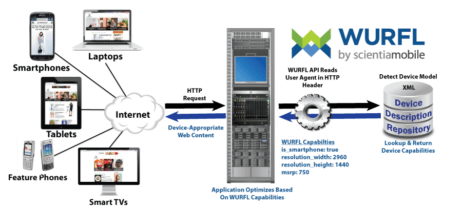
What is Device Detection?
Jul 26th, 2017
Have you ever wondered how the model and characteristics of your phone, TV, or computer are being analyzed and used? Well that’s device detection! It allows a website to create a page that’s optimized for a device model, browser, and operating system. Using device detection, websites can ensure a great user experience and improve performance.
Read More


