Why Are Mobile Devices Important for Car Websites?
Mobile devices are critical to the car buying process. AdColony's report, “The AdColony Car Buying Survey,” identifies that most car shoppers feel that smartphones are either “Very Important” or “Important” in the car buying process.
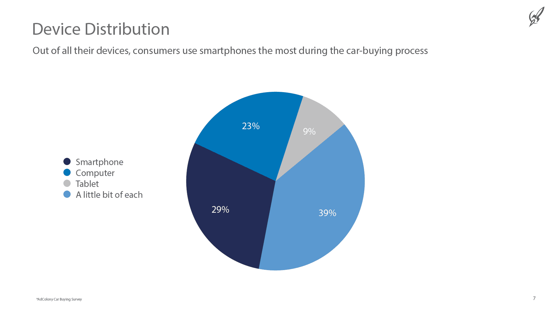
Car shopping occurs across multiple types of devices, including smartphones, desktops, and tablets. 39% of users use a combination of all of them.

How Do Car Buyers Use Mobile Devices?
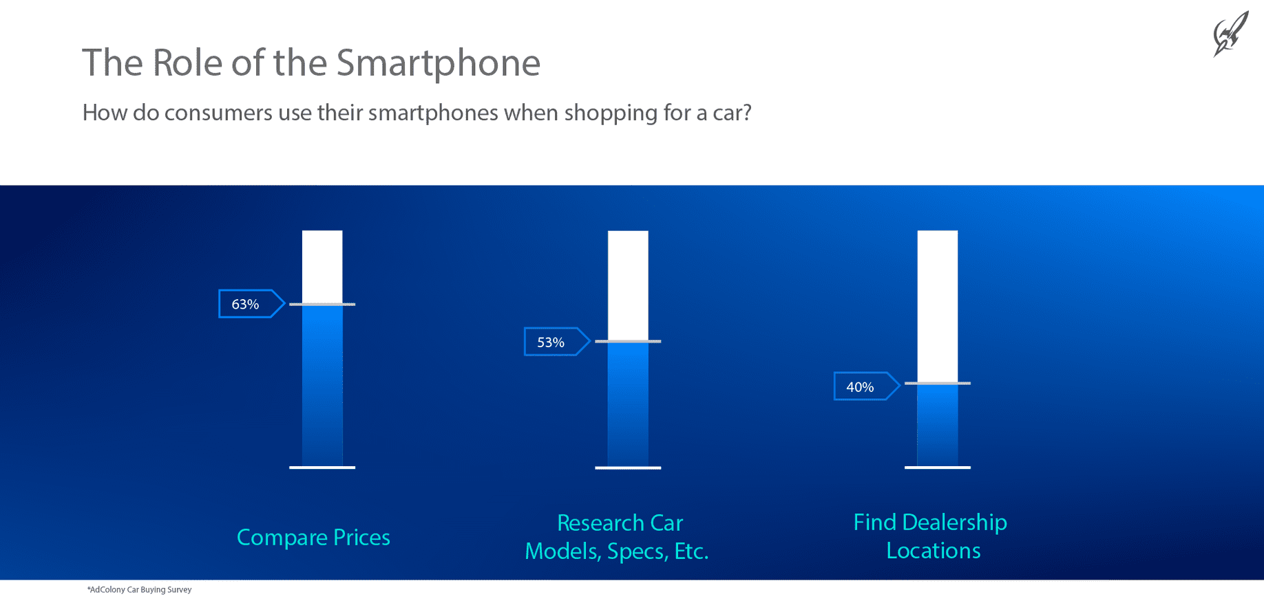
Buyers try to educate themselves about price and specifications on car websites. Given that most car buyers want to streamline the buying, test-driving, and inspection process, it is not surprising that buyers are using their mobile devices to improve that process. Mobility is a given these days.

Understanding the requirements of each mobile user and their devices who visit car websites can improve the mobile experience. Below are some steps that both car manufacturers, dealers, and sellers can take to improve the mobile experience.
Build Mobile-Friendly, Fast-Loading Car Websites by Using an Image CDN
Images are critical to selling cars. If buyers cannot immediately drive or touch the car, then seeing a picture is the next-best thing. The problem is that images are the biggest driver of any website’s payload. The bigger the payload, the slower a website will load. And load time is critical to a successful shopping experience. Most users expect a page to load in 3-5 seconds. However, the average page takes almost 8 seconds to load.
Responsive Images Enhanced by an Image CDN
So how can a car website with lots of images load faster? Images sent to a device are frequently larger than they need to be. A popular solution is to use responsive image techniques. This requires using picture, sizes, and srcset attributes and creating many image variations targeted to desktop, tablet and mobile devices. Front-end designers using responsive images need to manually make decisions on how to deliver images to a particular size viewport and then select the appropriately-sized image based on a pixel-size breakpoint defined in the code.
While this sounds straightforward, it means lots of work for sellers with thousands of pictures of cars. Each image needs multiple resized variations. Additionally, for each image, the developer needs to write many lines of code that selects the right-sized image. Even then, with a three-device approach, this does not necessarily optimize the payload entirely. If you want better optimization, you need to implement compression based on screen resolution and convert images to next-gen formats like WEBP. Here is an example of how a developer maintaining an auto website might use responsive code for desktop, tablet, and smartphones for a single image.

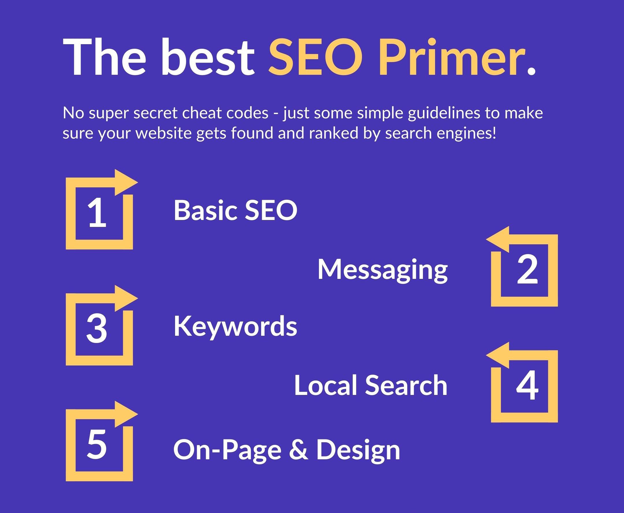
Look no further for your SMB SEO Guide - this is the only one you'll need.
Simplify Responsive Images With Automatic, More Effective Optimization
A more simple and effective way is to inject an image CDN like ImageEngine into your responsive website workflow. Because ImageEngine has device-aware edge servers, it can instantly optimize an image based on the screen resolution, Pixels Per Inch (PPI), and leverage modern efficient image formats like WEBP and JPEG 2000. It then caches the optimized image so that subsequent images are delivered directly from the CDN’s cache. And in cases where you want more control, you can use ImageEngine’s directives to serve the image exactly how you want.
In this example, we have reduced the 40 lines of example code found above to just one line by using ImageEngine.
<img src="//images.example.com/images/acura-tlx.jpg?imgeng?/w_auto,200/"
sizes="(min-width: 30em) 200px, 500px">
This means a website can stick with one large, high-quality master image of the car and let the image CDN automatically reformat an optimal image that is tailored to each specific device model’s specifications. It will also benefit from faster delivery with a CDN that automatically applies compression and serves the most effective next-gen image format.
