Blog
Recent Posts

Where’s the Money? Target Your Ads Based on the Price of Viewer’s Smartphone
Nov 4th, 2016
When you advertise on the web, there’s not much you can instantly discern about your audience. With WURFL device intelligence, you can now pinpoint the price of the smartphone model your mobile viewers are using.
Read More
Golang Device Detection and WURFL: an Overdue Marriage
Oct 25th, 2016
“It does not matter how slowly you GO as LANG as you do not stop” – Confucius, slightly adapted
Here at ScientiaMobile, we have heard requests over the last several years for a WURFL API that supported the Go programming language (AKA golang).
Read More
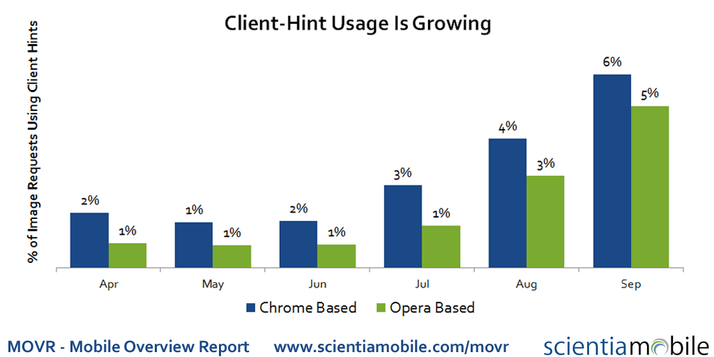
Client Hints in the Wild
Oct 19th, 2016
Client Hints usage is growing for to help optimize images. The Mobile Overview Report 2016 Q3 (MOVR) shows 6% of images from Chrome browsers now use client hints. And both mobile and desktop usage is growing.
Read More

Recalling Samsung Galaxy Note 7 Not So Easy
Oct 12th, 2016
Update on November 3rd: We now see that users are heeding the recall. Usage for Samsung Note 7 has dropped consistently over the last 3 weeks. The usage has dropped to 33% of its peak level.
Read More

Case Study: Crazy Factory Optimized Image Delivery
Sep 5th, 2016
Having a rather young audience, mobile and multi-device access is important. Items from the online store is not only browsed on mobile, but also shared through social networks, where the primary use case is mobile. Further, to emphasize the importance of mobile usability for storefronts like crazy-factory.com, one third of all transactions on black Friday 2015 came from mobile devices.
Read More
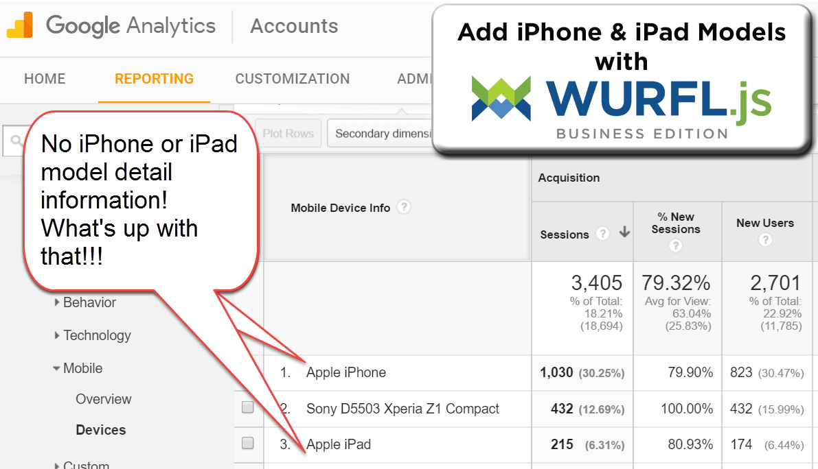
More Mobile Insights in Google Analytics with WURFL.js
Aug 22nd, 2016
The Google Adwords team recently published a post on how to get better insights into mobile traffic on a web site.
Read MoreMost businesses see a shift in customer behavior that indicates customers are both more comfortable converting on their mobile devices and are shifting their research to mobile. To understand this better, we have created a new dashboard for you that helps you analyze mobile specific data for your own website.
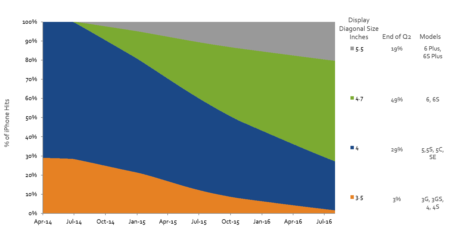
iPhone Users Moving to Larger Screens
Aug 19th, 2016
In the latest MOVR report, we looked at iPhone Screen size trends. We compared Apple’s new model releases, looking to see if there was a preference for size. Roughly, the iPhone SE is small (diagonal display size of 4”), iPhone 6S is medium (4.7”), and iPhone 6S Plus is large (5.5”).
Read More
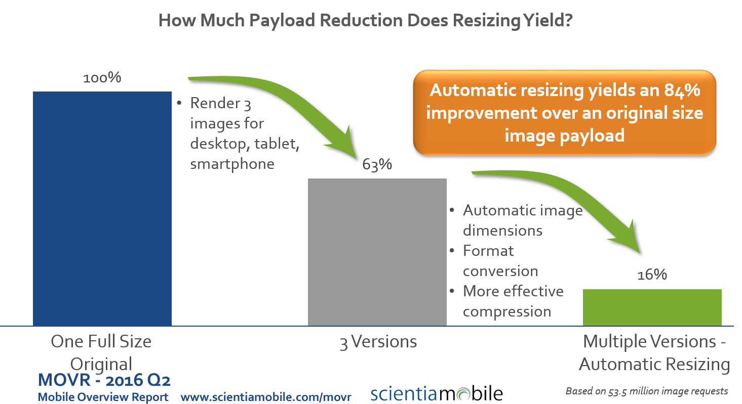
Are 3 Image Sizes Enough for Responsive Web Design Sites?
Aug 19th, 2016
The answer is: if you care about mobile performance and payload, then you need a better solution than only 3 image sizes. We evaluated over 53 million requests for images from 1.6 million distinct urls (see our MOVR report).
Read More
5 Steps to Add iPhone Models to Google Analytics with WURFL.js
Aug 19th, 2016
Do you want to add information on iPhone models to Google Analytics? Then check out our infographic and follow the 5 steps below.
Read More

Is Your Responsive Design Working? Google Analytics Will Tell You
Aug 18th, 2016
Responsive web design has become the dominant method of developing and designing websites. It makes it easier to think “mobile first” and to create a website that is viewable on mobile devices.
Read More


