Blog
Recent Posts
More Mobile Insights in Google Analytics with WURFL.js
Aug 22nd, 2016
The Google Adwords team recently published a post on how to get better insights into mobile traffic on a web site.
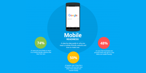
Read MoreMost businesses see a shift in customer behavior that indicates customers are both more comfortable converting on their mobile devices and are shifting their research to mobile. To understand this better, we have created a new dashboard for you that helps you analyze mobile specific data for your own website.
iPhone Users Moving to Larger Screens
Aug 19th, 2016
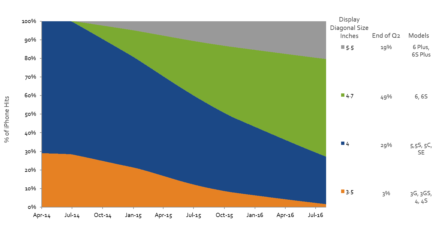
In the latest MOVR report, we looked at iPhone Screen size trends. We compared Apple’s new model releases, looking to see if there was a preference for size. Roughly, the iPhone SE is small (diagonal display size of 4”), iPhone 6S is medium (4.7”), and iPhone 6S Plus is large (5.5”).
Read More
Are 3 Image Sizes Enough for Responsive Web Design Sites?
Aug 19th, 2016
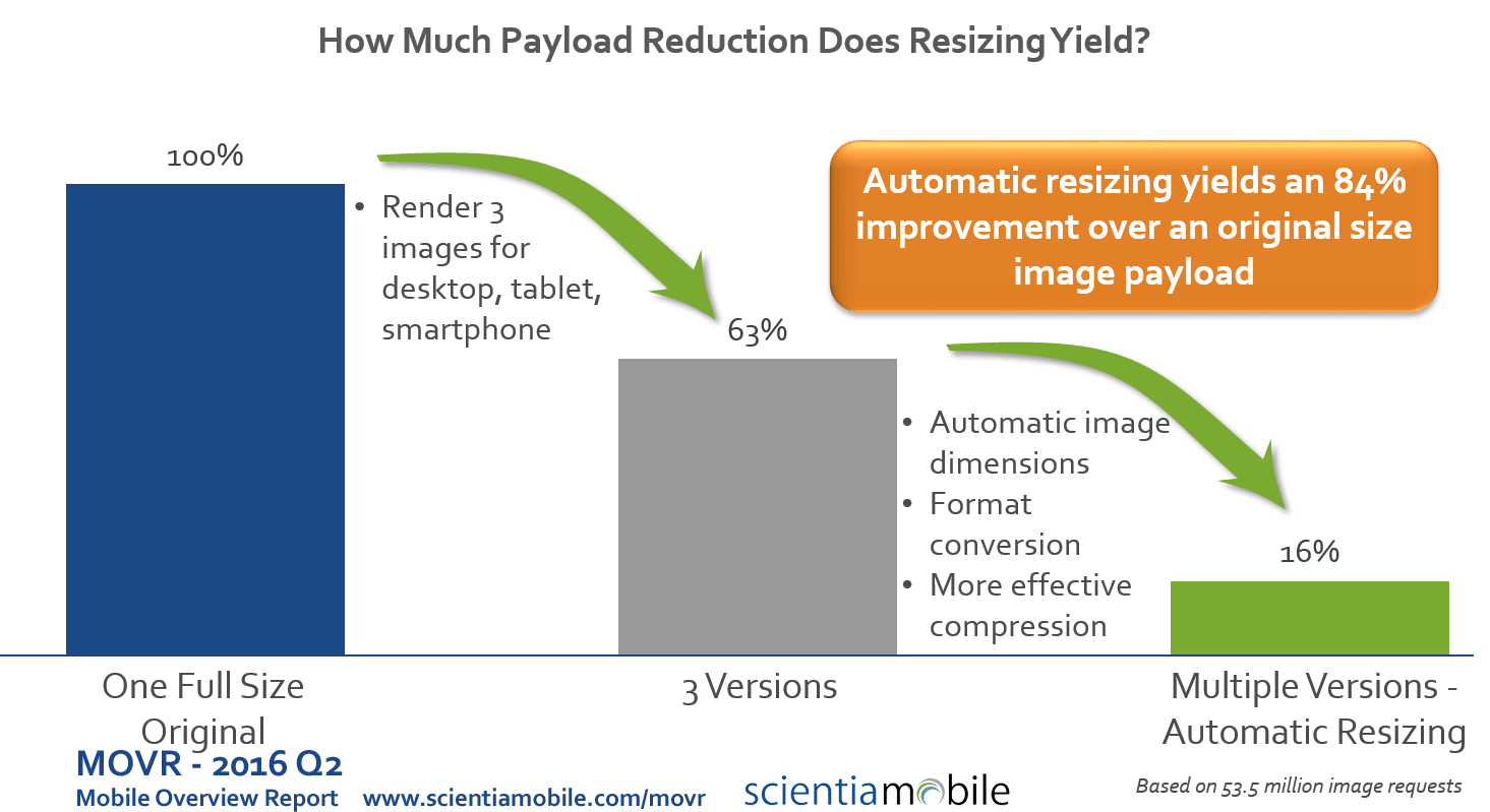
The answer is: if you care about mobile performance and payload, then you need a better solution than only 3 image sizes. We evaluated over 53 million requests for images from 1.6 million distinct urls (see our MOVR report).
Read More
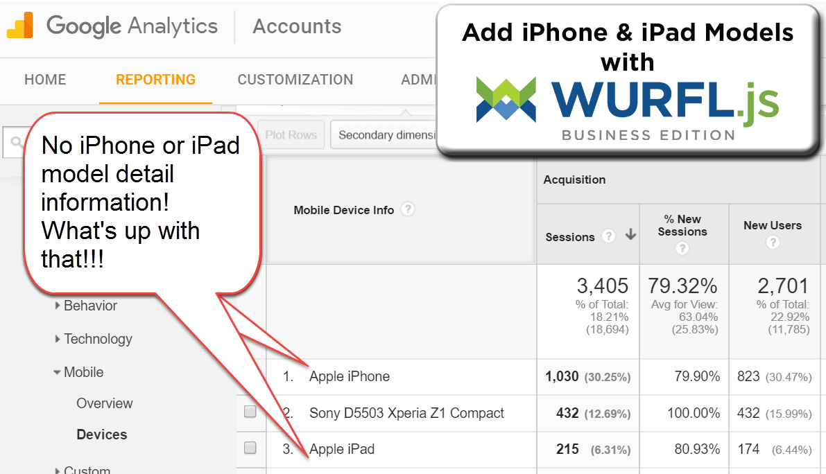
5 Steps to Add iPhone Models to Google Analytics with WURFL.js
Aug 19th, 2016
Do you want to add information on iPhone models to Google Analytics? Then check out our infographic and follow the 5 steps below.
Read More

Is Your Responsive Design Working? Google Analytics Will Tell You
Aug 18th, 2016
Responsive web design has become the dominant method of developing and designing websites. It makes it easier to think “mobile first” and to create a website that is viewable on mobile devices.
Read More


